

 Deutsch
 Español
 Français
 Hrvatski
 Italiano
 Polski
 Português (BR)
Fill in the Form of a Ticket
Overview
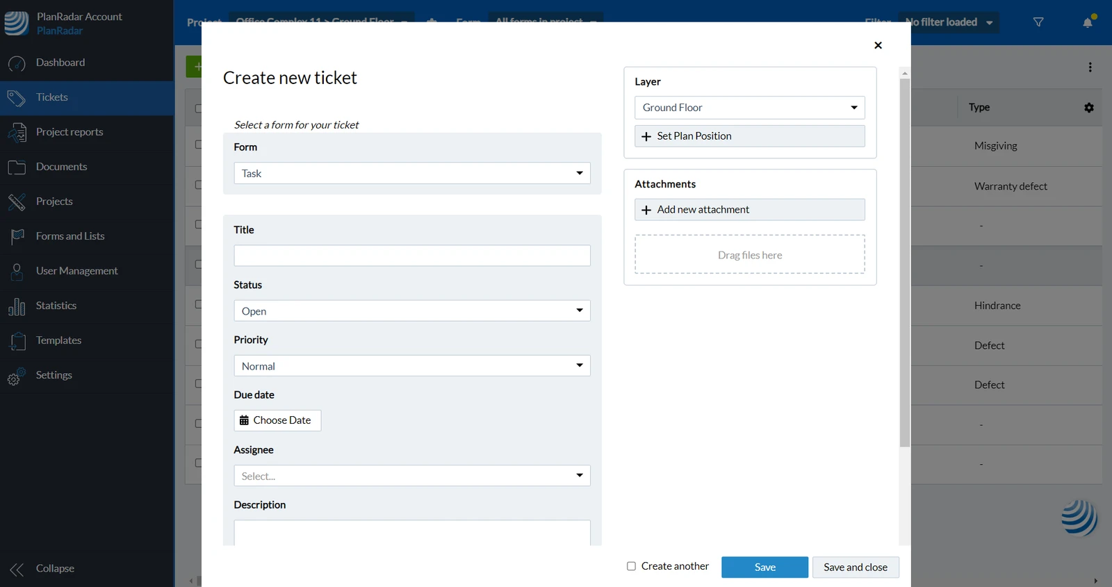
You may have started with Create a Ticket and progressed to Select a Form, or you may be editing an existing ticket. Here you will learn how to fill in the form of a ticket and about predefined and custom fields.
Access & Permissions
Predefined Fields
Predefined fields come with special functionality e.g. where you see the title, how the status is visualised or what happens with assignee, receivers and due dates.
The following predefined fields are available:
Title
Each ticket should have a title. It helps to identify the ticket, besides the ticket ID, which is an automatically assigned sequence number. The title should briefly summarise the purpose of the ticket without being too long.
Status
Using the status field is recommended whenever you have a workflow where tasks or issues get assigned to be worked on and resolved.
Each status has a colour assigned.
Progress
Track the progress of the ticket as a percentage.
Assignee
The assignee is the person who works on the ticket to resolve it.
Receiver (CC)
Add users as receivers to keep them informed about activities in the ticket - similar to the CC field in emails. They will get notifications as if the ticket was assigned to them.
Due Date & Extension Date
Set a due date to automatically send reminders before the due date is reached. Use extension dates if the due dates were not or will not be met.
Priority
The priority field is set to Normal by default. You can change it to Low or High to show which tickets should get resolved first.
Parent Ticket
By selecting a parent-ticket your current ticket will become a sub-ticket of the selected parent-ticket.
Custom Fields
Custom fields have a custom name and one of the following field types assigned.
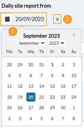
Date
To set a date:
- Click Choose Date to open the date picker
- Click on the day to select it
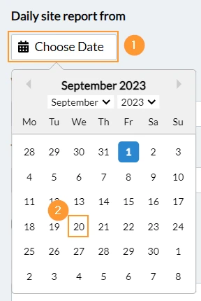
- Select a month in the drop-down menu before selecting a day
- OR click next month
- OR click previous month
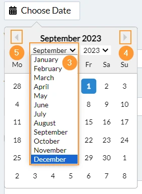
- Select a year in the drop-down menu before selecting a month
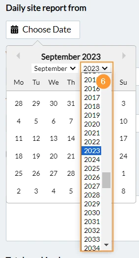
To change/delete a date:
- Click on the date to open the date picker and select a new date
- OR click X to remove the date.
Time
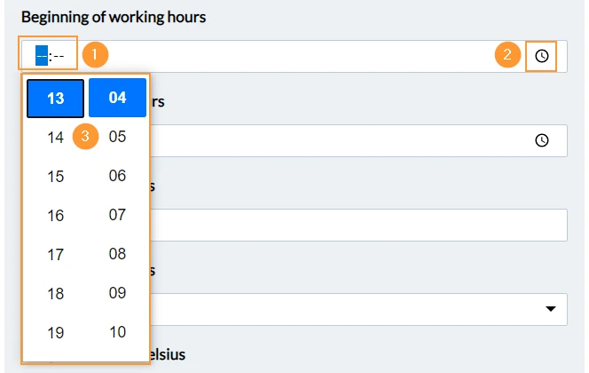
To set a time:
- Enter the hours and minutes on the keyboard
- OR click on the hour icon
- Then click on the hours and minutes
List
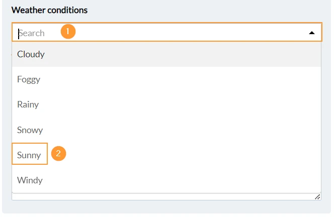
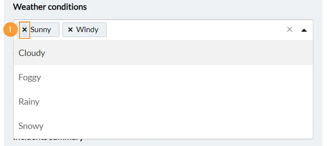
To select one of the provided values of a list field:
- Click Select... to open the drop-down menu
To search for values start typing when the drop-down menu is open. - Click on the value e.g. Sunny to select it
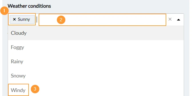
To clear the selected value(s) from a list field:
- Click X

To select an additional value:
- Selected values are displayed with a grey background
- Open the drop-down menu again to select another value
- Click on the value e.g. Windy to select it
To clear a single value from a list field:
- Click X next to the value
Short & Long Text
Short text fields are limited to one line.
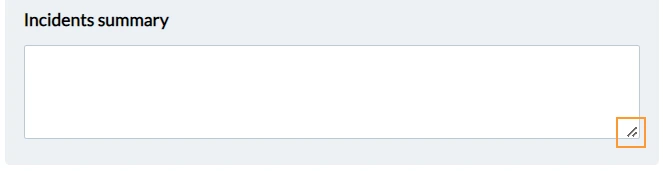
Long text fields can have multiple lines. By default 3 lines are displayed, but you can drag & drop the frame to show more lines temporarily.
Number & Decimal
Number fields allow only whole numbers, e.g. '25', while decimal fields accept decimal numbers. The decimal separator is always represented by a dot ('.') regardless of your language setting.
To enter a number or decimal number:
- Click on the field and start typing on your keyboard
- Or use the arrow buttons to increase or decrease the number

Check box
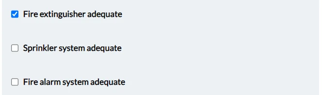
The check box field is clear by default. Select the check box to show the check mark.
User
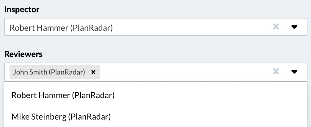
A form might have custom user fields, which work similar to the assignee and receiver field.
Attachment
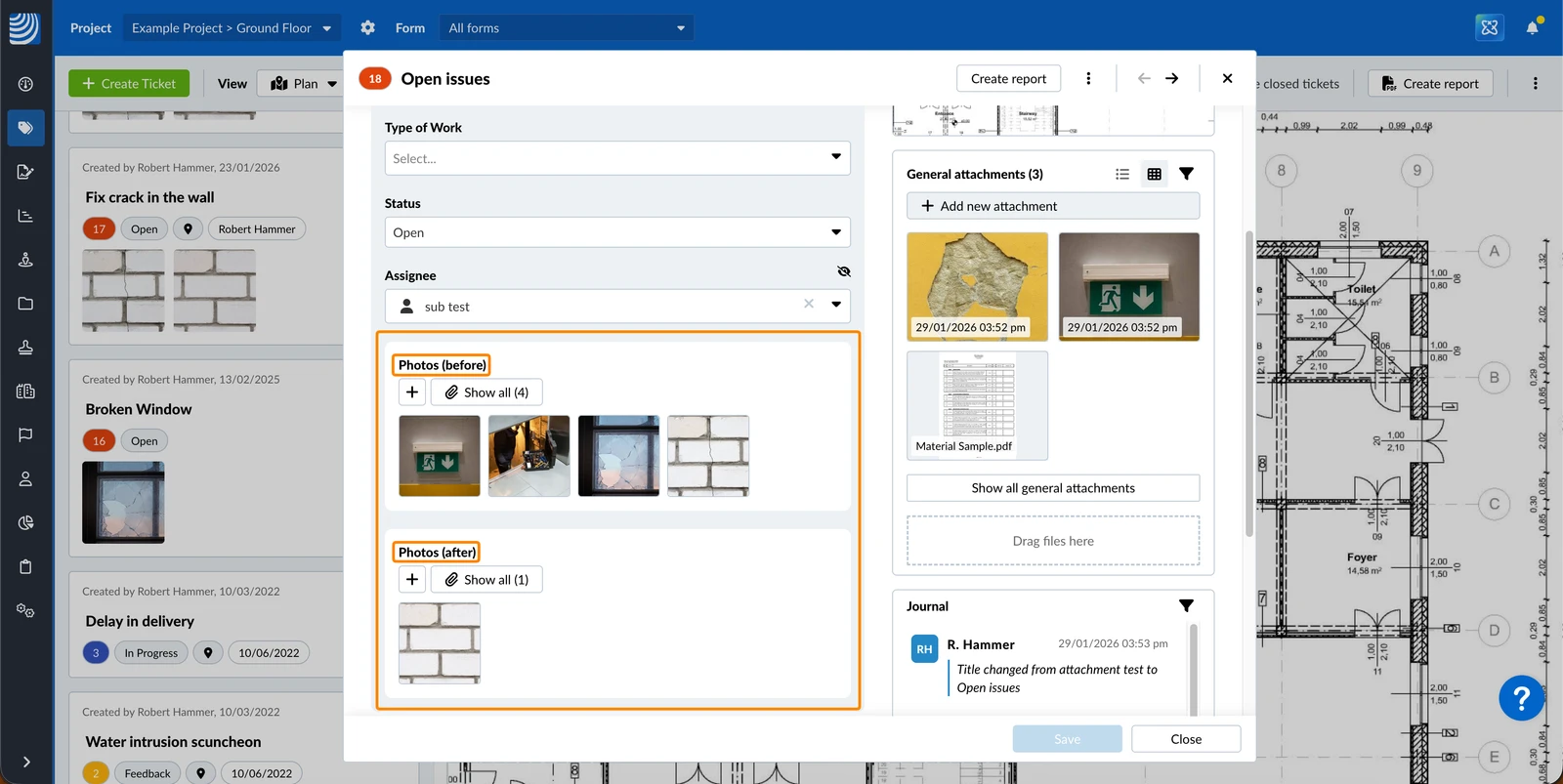
A form might have custom attachment fields. They work similar to generalt ticket attachments, but help to separate attachments by purpose. For example, you can capture before-and-after photos in a separate field.
Checklist
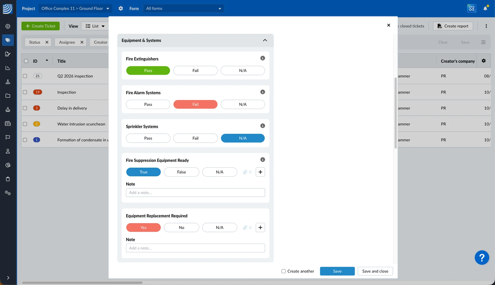
A form might have custom checklist fields. They allow selecting one of three response options and optional/mandatory notes, attachments or linked tickets. The response options and colours can be configured for each checklist field from predefined sets of options e.g. Yes (green), No (red), and N/A (blue).
Example of different response options and colours:
Checklist: Select Responses
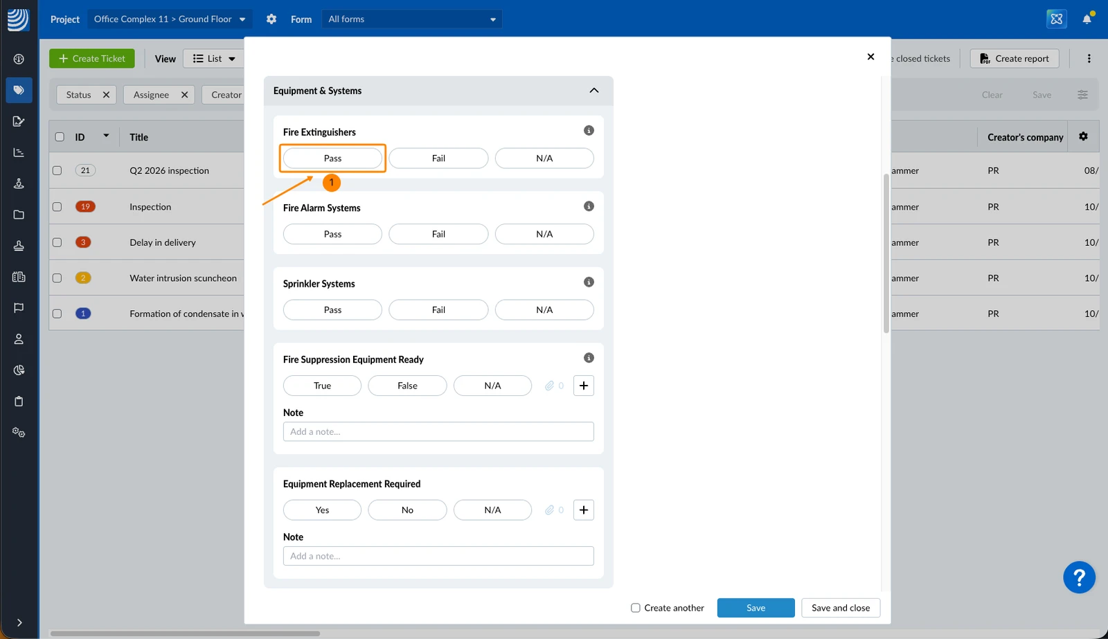
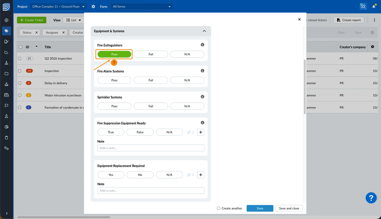
To select a response:
- Click on the response e.g. Pass
- You see selected responses with a background colour as defined for each checklist field e.g. green
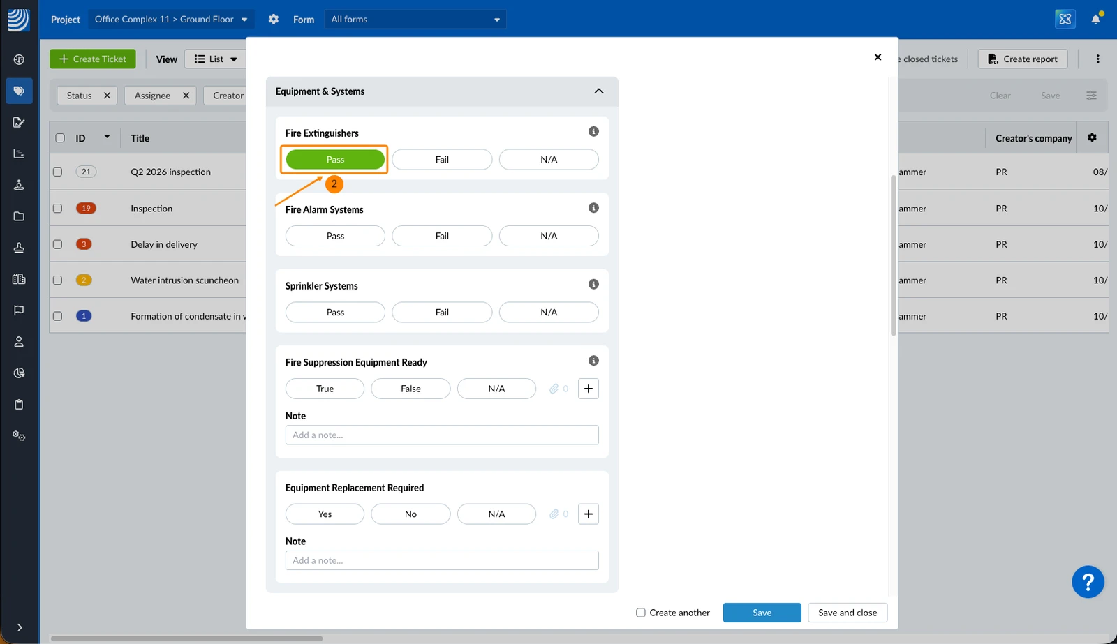
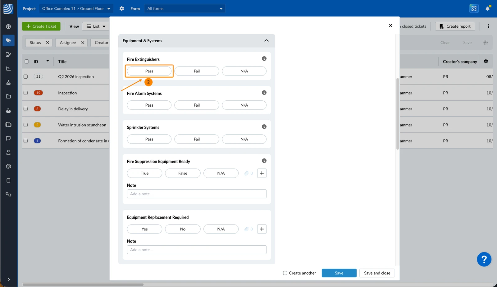
To deselect a response:
- Click on the response e.g. Pass (with a background colour e.g. green)
- You see deselected responses without a background colour
Checklist: Notes
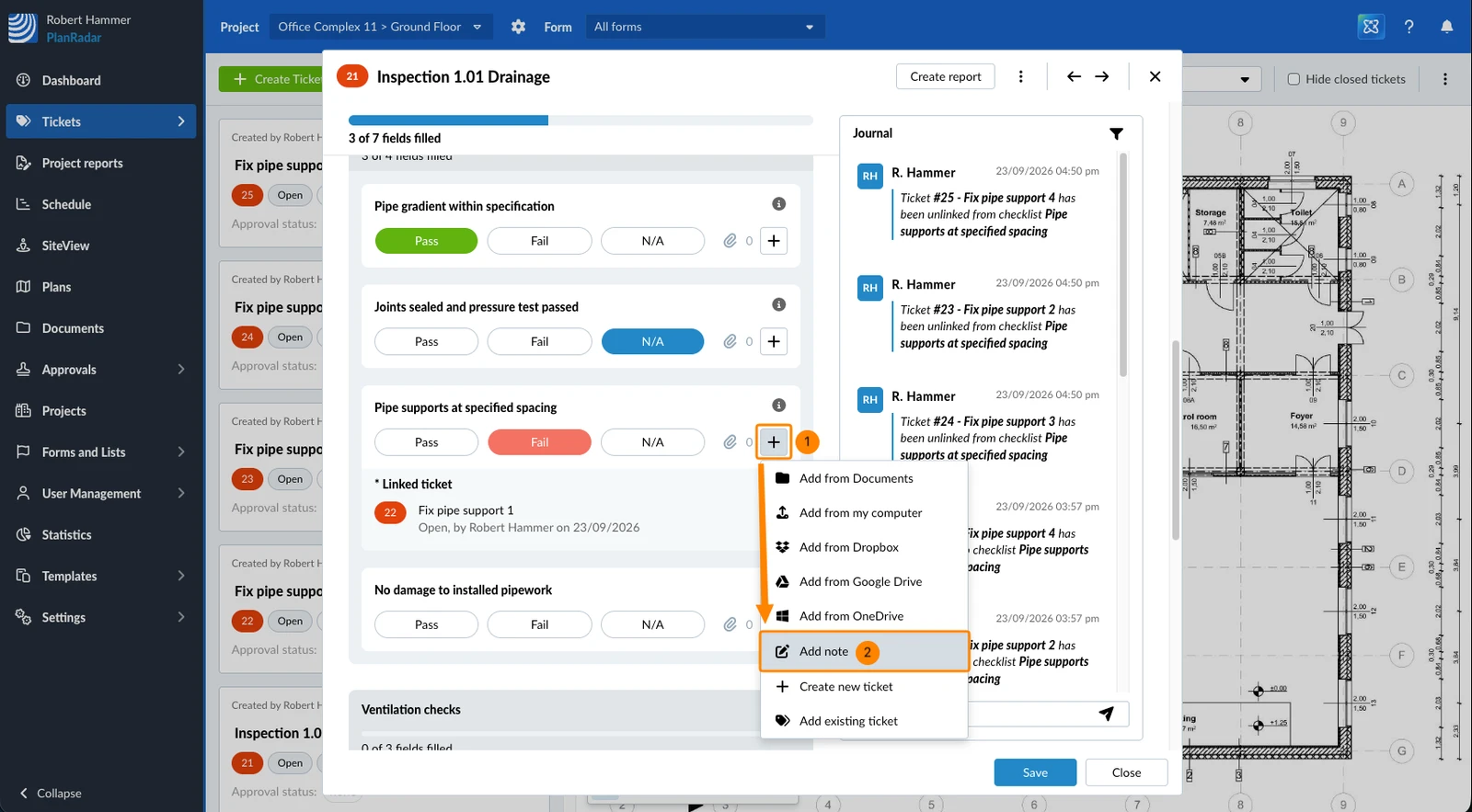
To add a note (in case the checklist field has this property enabled):
- Click the + icon on the checklist field
- Click Add note
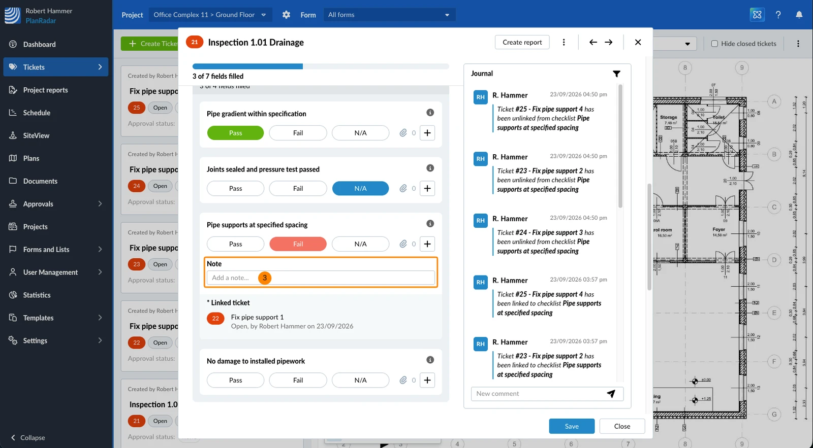
- Enter the note
- Tap Add... on the checklist field
- Tap Add note
- Enter the note
A note stays visible on the checklist field once it has content, or when a note is mandatory for the response you selected. Otherwise it sits behind the + button. On the mobile app, a saved note is shown with an Edit Note link rather than an open text field.
Checklist: Attachments
To add one or more attachments to a checklist field:
- Click the + icon
- Click Add from my computer
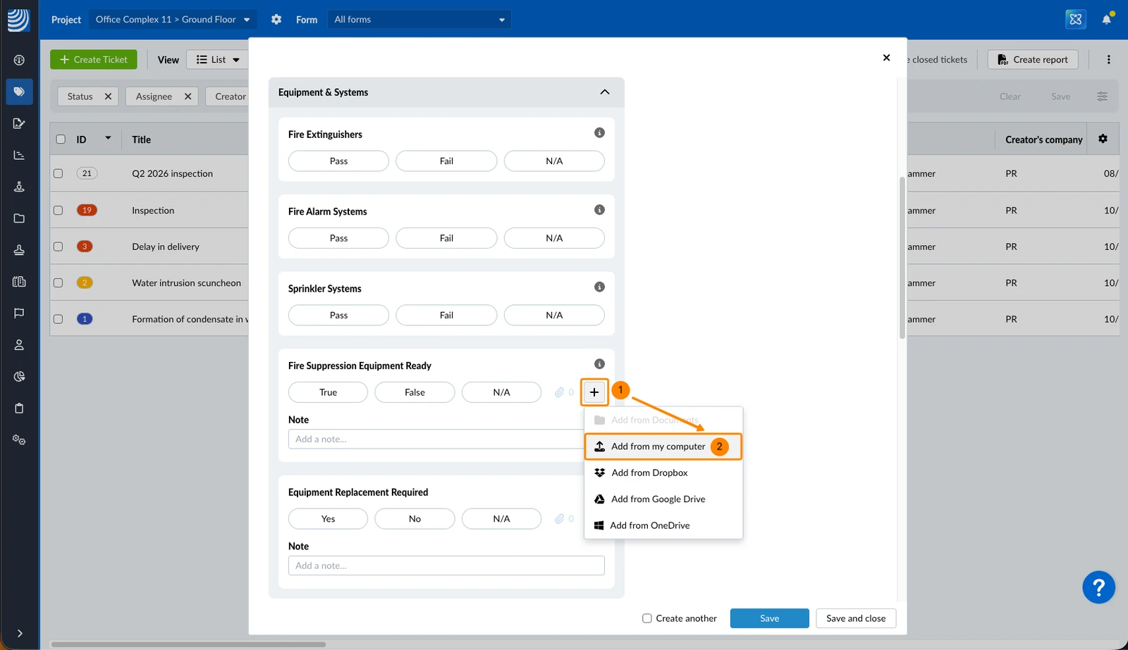
- Select the files in your computer's file browser
- Tap Add... on the checklist field
- Tap Photos, Videos, Camera or Files
- Select the files
To view attachments of a checklist field:
- Click the number of attachments
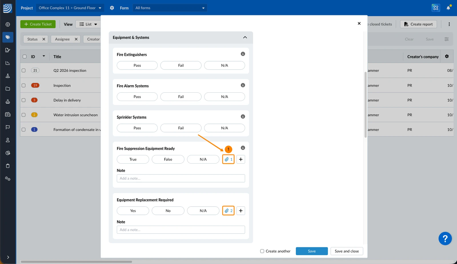
- Tap Show attachments (N) on the checklist field
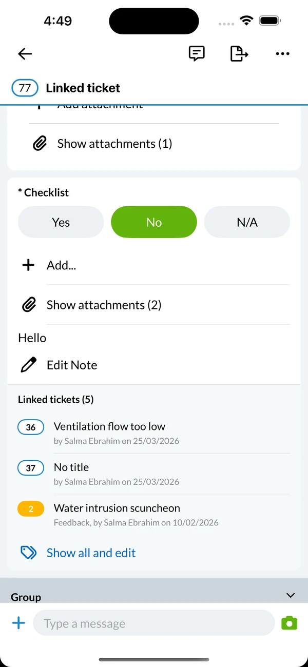
On the mobile app, the attachment action sits behind the + button until the checklist field has attachments, or when an attachment is mandatory for the response you selected. In the webapp the attachment counter stays visible on the checklist field either way.
Checklist: Linked Tickets
From a checklist field you can create new tickets or link existing ones, so the issues you find while filling in the form are documented as tickets attached to that exact question. The linked tickets are listed on the checklist field with their title and status.
Mandatory Fields
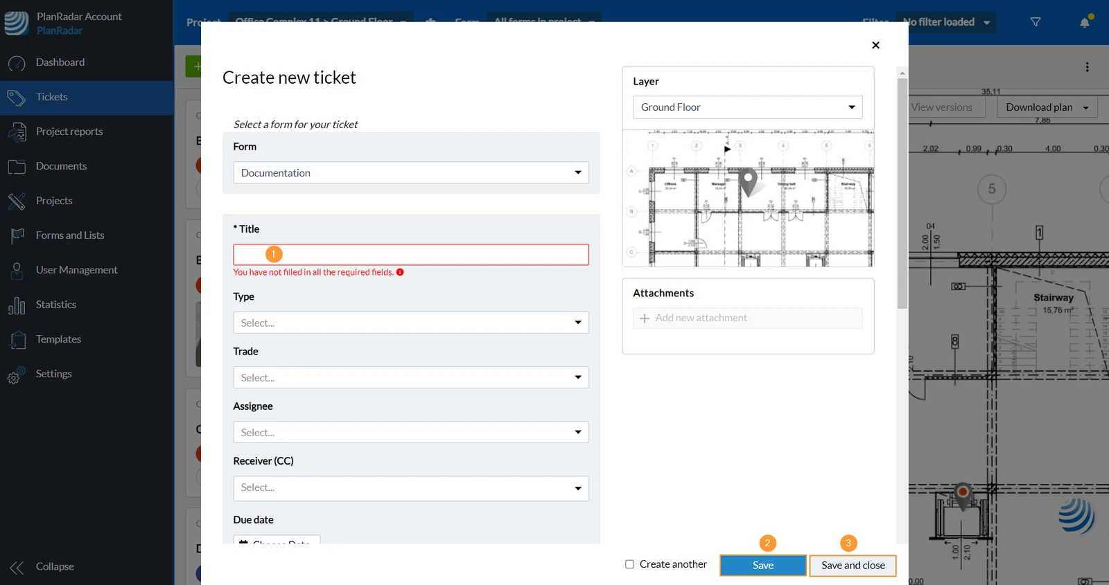
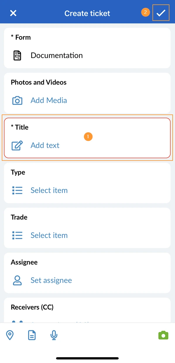
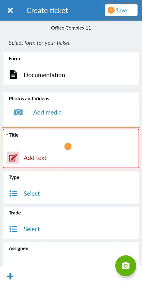
Each field can be defined as mandatory, which means you have to fill it out before you can save the ticket.
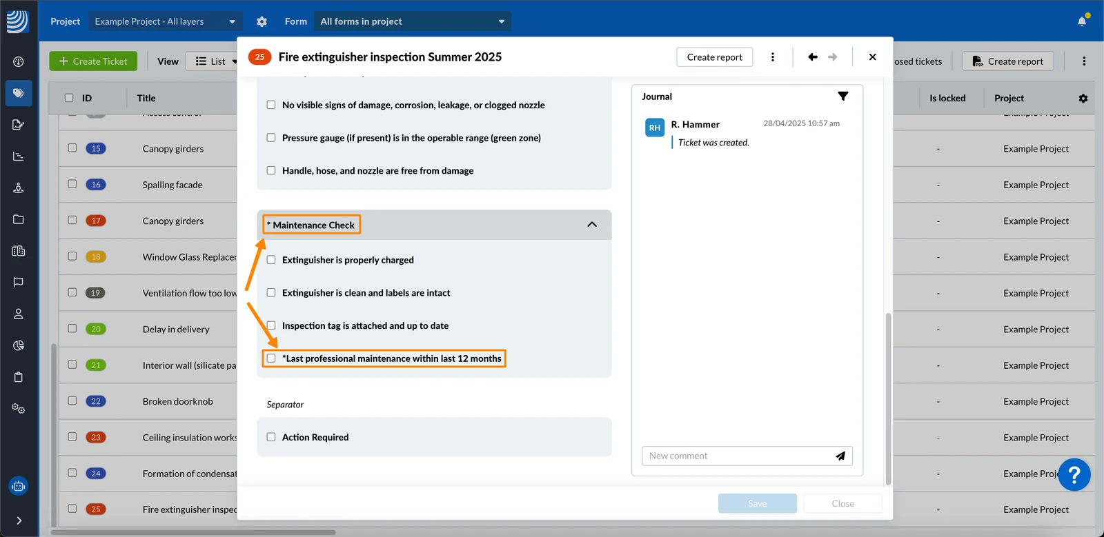
Mandatory fields are highlighted with an '*' before the field name:
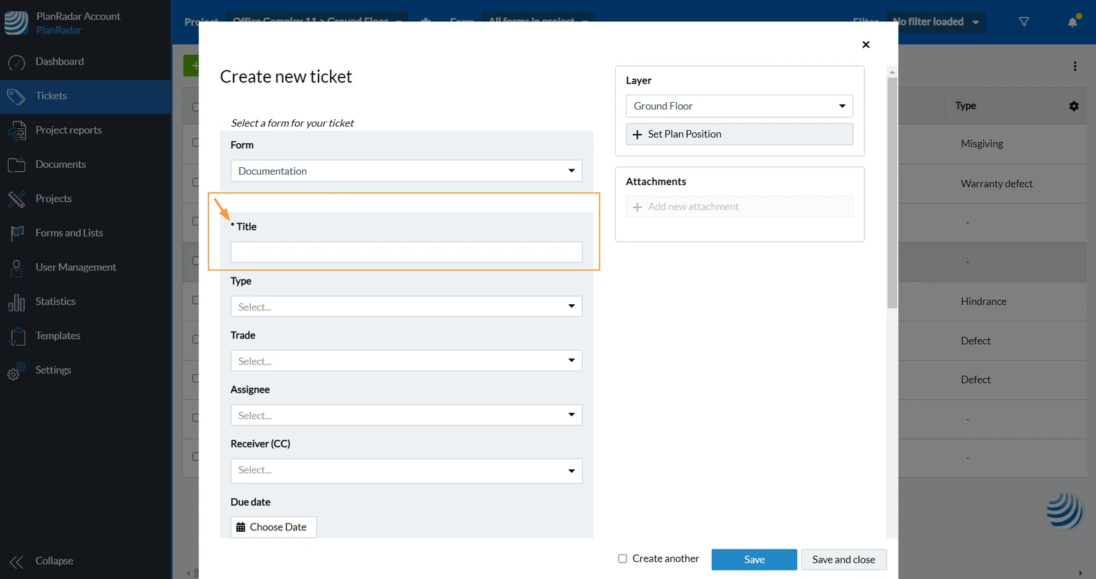
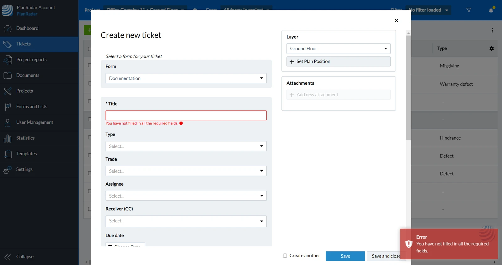
If you forget to fill out mandatory fields before saving a ticket, you will get an error and the required fields will get highlighted:
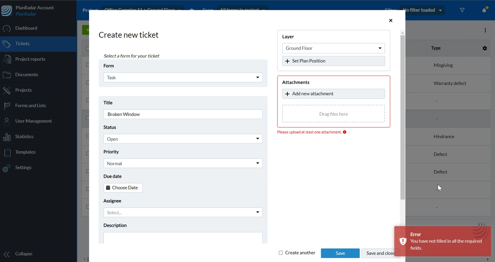
It is also possible that attaching a photo or video is mandatory. If this is not done, you will also get a warning:
Ticket Field Groups
Ticket fields can be grouped, allowing you to collapse and expand the fields in the group.
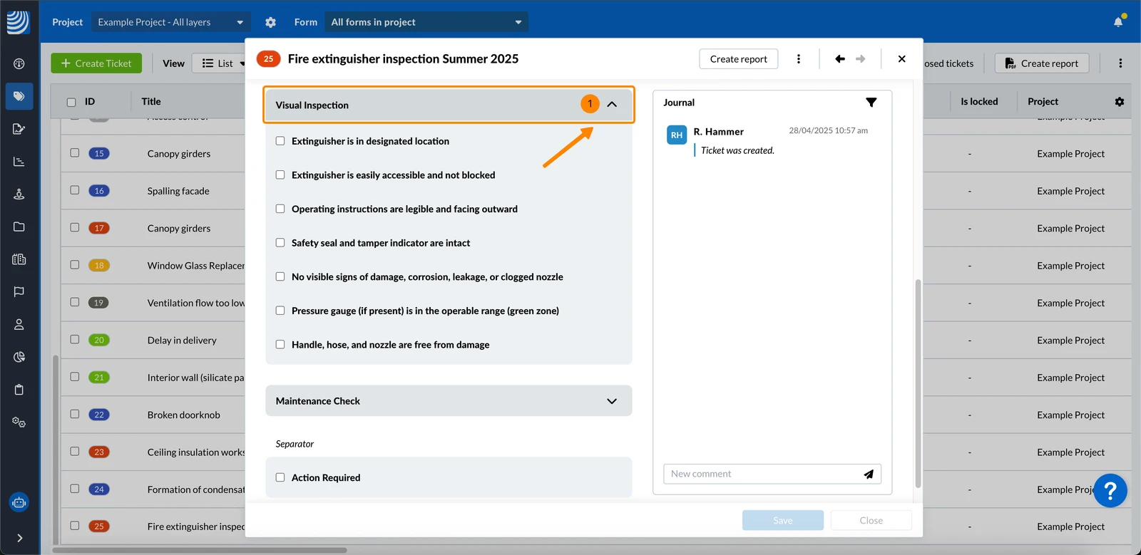
To collapse the fields in a group:
- Click on the group header with the up arrow
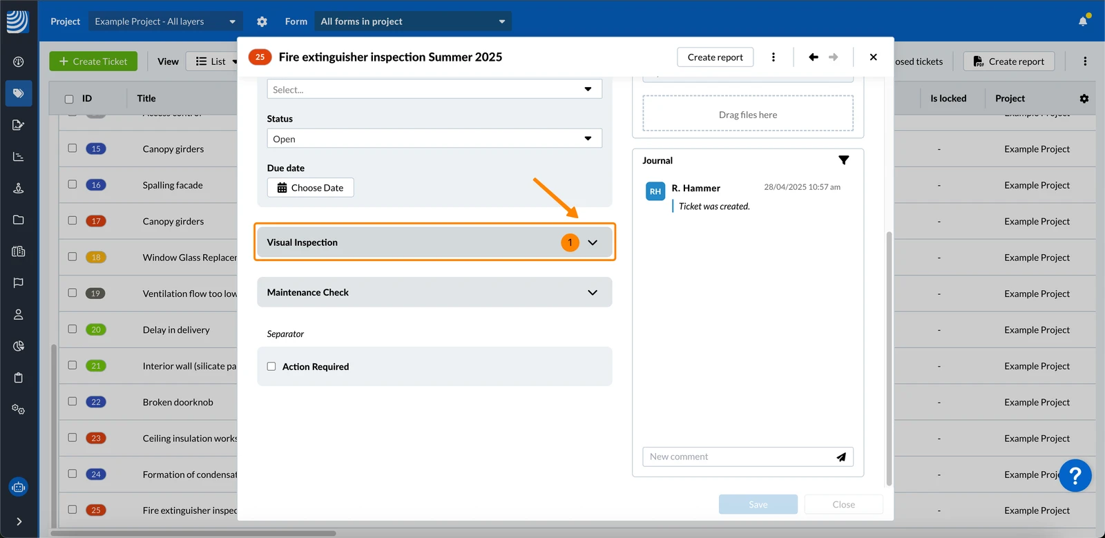
To expand the fields in a group:
- Click on the group header with the down arrow
If a group contains mandatory fields, the group will also display the *.
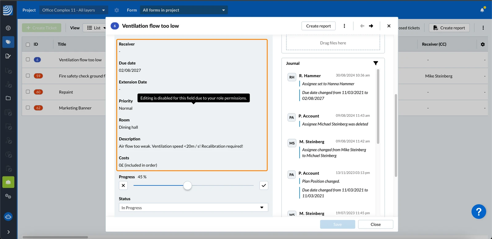
Field Permissions
Ticket fields that you don't have permission to edit have a grey background:
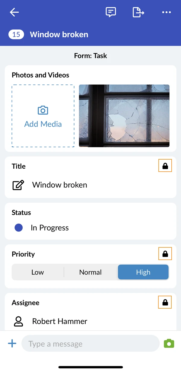
Ticket fields for which you don't have edit permission show a lock icon:
Conditional Visibility
Some fields in the form may only appear when specific conditions are met. For example, selecting a certain list item could display an additional text field to capture more details.
Ticket Completion Bar
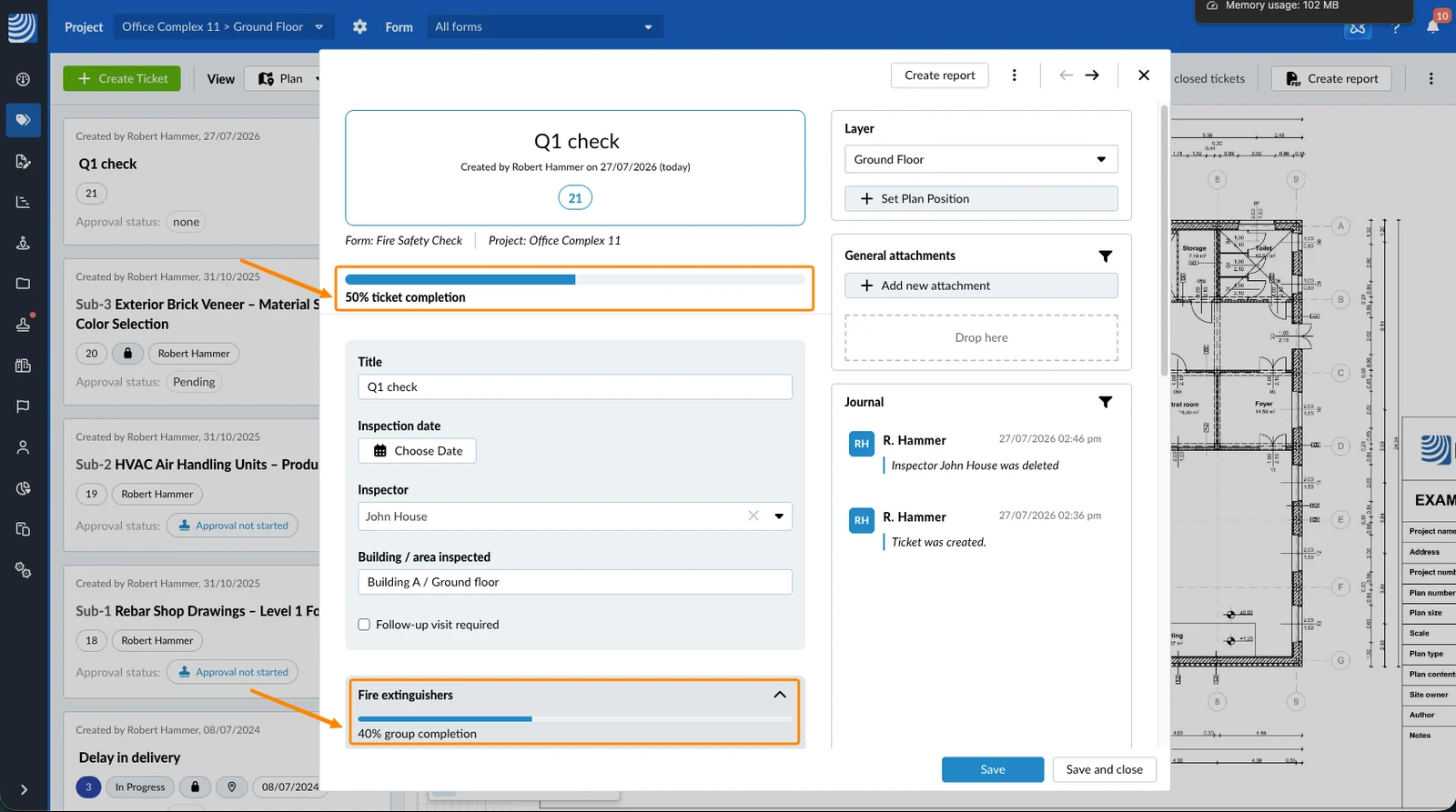
If the completion bar is enabled for your form, a bar at the top of the ticket shows how complete it is as a percentage, for example 50% ticket completion. It updates live as you fill in fields, with no need to save, and is read-only — you cannot set its value by hand.
When a form uses field groups, a group can have its own bar at the top of that group, shown the same way, for example 40% group completion.
Example of a ticket completion bar and a grouped completion bar:
A field counts as completed once it has a value — for example text typed in, a number, date or time set, at least one option chosen in a list or user field, or at least one file added to an attachment field. A checklist field counts once you select a response and add any note or attachment that response requires.
Fields that already have a default value count as completed from the moment you open the ticket, so the bar may start above 0%.
The bar only counts fields you can actually see. Fields hidden by Field Permissions or by Conditional Visibility drop out of both the count and the total, so two people can see different completion percentages for the same ticket.
The completion bar works the same way on the web, iOS and Android. On mobile it is calculated on your device, so it keeps updating even when you are offline.
Save a Ticket
A ticket can be saved anytime if all mandatory fields are filled.
To save a new ticket:
- Fill out all mandatory fields
- Click Save to save the ticket and keep it open
- Optional: Click Save and close to save the ticket and close it
- Fill out all mandatory fields
- Click the Check mark to save the ticket and close it
- Fill out all mandatory fields
- Click Save to save the ticket and close it
Once saved, tickets are instantly synced across devices if you are online.
Updated August 20, 2026